Zurich Insurance
SERVICES:
Brand Refresh
Art Direction
Animation
TEAM:
72andSunny Amsterdam
WEBSITE:
zurich.com
SOCIAL:
@zurichinsurance
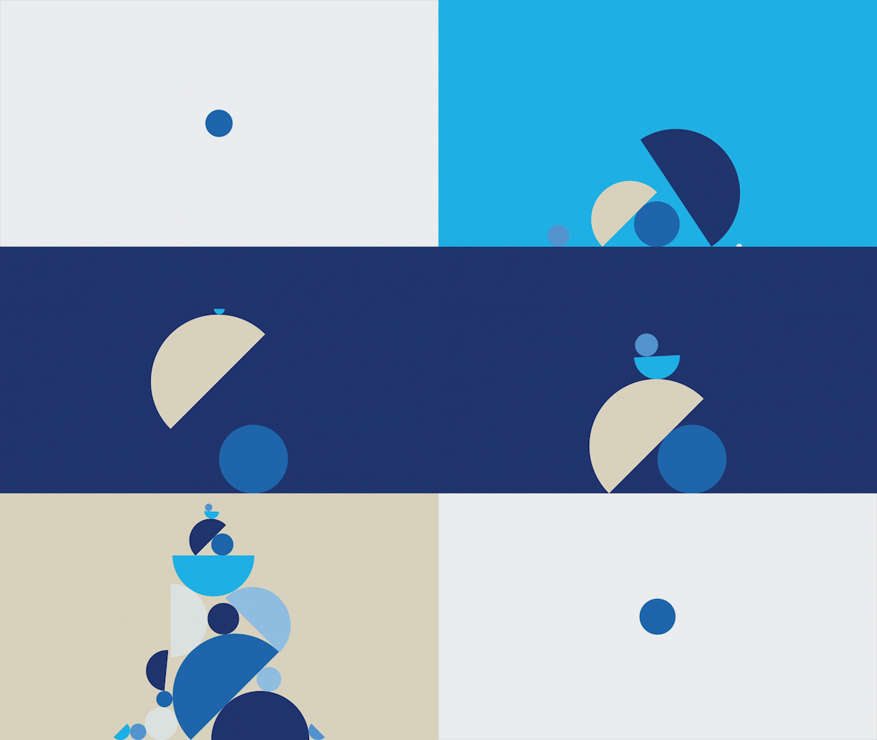
Zurich Insurance is a company with a rich history of over 150 years in the insurance category but like many old companies, Zurich struggled to connect in a meaningful way to their consumers. Working with a small team at 72andSunny Amsterdam, we refreshed Zurich’s design language; building a more consumer-centric, open and optimistic look and feel for the brand. The identity is a reflection of the relationship that Zurich is aiming to build with its customers – putting people at the center of their business.
LOGO
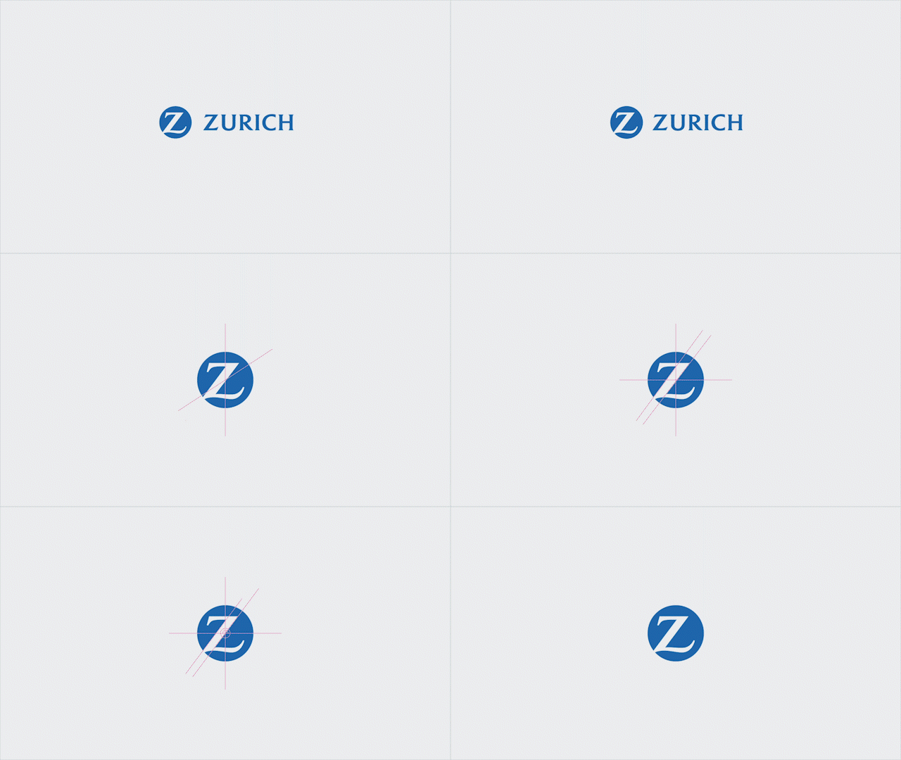
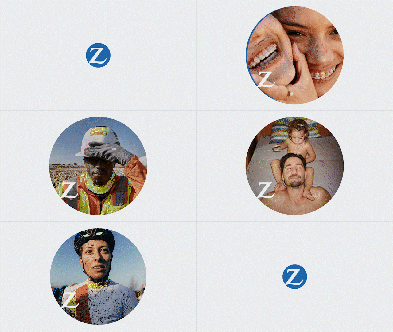
At the core of the logo refresh is a new behavior for our ‘Z’ mark – what we are calling the ‘Safe Space.’ Because we wanted Zurich to be part of people’s lives, we adapted the logo to expand and become a window that shows the relationship that Zurich fosters with their customers, businesses and other brands. In static media, film, social and digital, the ‘Safe Space’ offers a space to help people think, grow and imagine.
COLOR
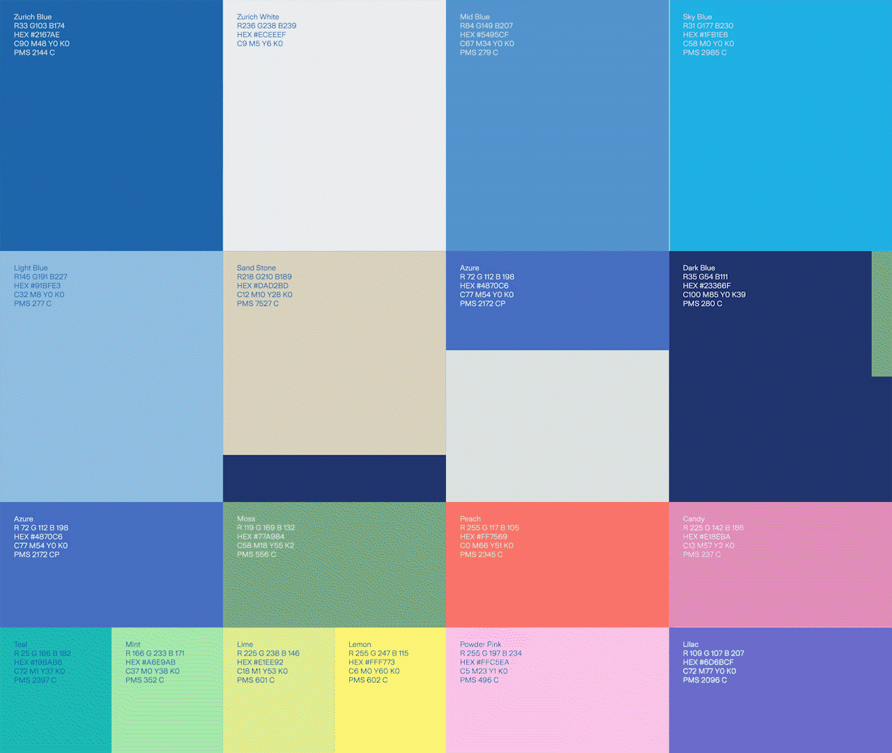
We adapted the Zurich core brand palette to create a cleaner, fresher, more harmonious overall set. We also have a new approach to using colors outside of the brand palette that is more inclusive, to reinforce a warm brand personality that is open and embraces optimism.


